Who is Edward Tufte?
Professor Emeritus of Political Science, Statistics, and Computer Science at Yale University
Honorary degrees from Williams College, Connecticut College, Cooper Union, Saint Joseph College, Maryland Art Institute, Minneapolis College of Art, and University of the Arts.
Fellow at American Academy of Arts and Sciences, Guggenheim Foundation, American Statistical Association, Center for Advanced Study in the Behavioral Sciences, Society for Technical Communication
Consulting and courses on data analysis and display design: NASA, Apple, The New York Times, IBM, Bose, Fidelity Investments, Centers for Disease Control and Prevention, Google, President’s Commission on Federal Statistics Medtronic, New Jersey Transit,
Thoughts on the workshop
It is a very engaging workshop and Tufte is an entertaining presenter.
Great for a beginner. Pro's just buy his books and read through them over a week (great content and lots of it).
During the course of this day-long seminar, he showed compelling examples of how good design can facilitate clear thinking and effective decision-making.
Some people feel, it does seem to be a show on autopilot and way too scripted to feel like a workshop. Some would feel, It is about his presentation style, not his content.
I think the main issue is what are your expectations going into it. If you are already well acquainted with him and merely want to see him talk live, it is kind of fun.
I got an opportunity to talk with Professor Tufte during the break in his workshop, “Presenting Data And Information”. It was a short but interesting conversation where mentioned, “What I really hope to do is teach people how to think.”
He later continued, “The deep principles of information design have a universality… because they are rooted in principles of analytical thinking.” He elaborates that point by explaining how we as the humans understand information. The way we see and interpret it. And why this insight should be used to optimize the representation of information.
In an age of chart junk, information overload, and slapdash presentations Professor Tufte offers a compelling prescription for better decisions, better design and better thinking
Course details
It is difficult to really engage him due to long lines and Tufte's veteran assistants marshaling people along.
Books
So these are his books in order of publication. It is generally recommend that you read them in order of publication

The Visual Display of Quantitative Information (1983) is the classic text that started it all. Its his oldest book. It also is the most textbook-like of the four books; focusing more on specific rules, rather than just showing you examples of good graphical communication and pointing out why they're good.
Envisioning Information (1990) and Visual Explanations (1997) are his masterworks, in my opinion: lucid prose with excellent examples from the past several hundred years. The amount of research and thought in these books is immense. These two books teach by example, and that works very well for me.
Beautiful Evidence (2006), well, I would get it just to complete your set. It's not as good as the others. He starts going on a little too much about beauty and truth in this book for my taste.
Useful Concepts
Sparkline
A Sparkline is a small intense, simple, word-sized graphic with typographic resolution. Sparkline graphics can be everywhere a word or number can be: embedded in a sentence, table, headline, map, spreadsheet, graphic.

Mr. Tufte has worked for Apple as a consultant and we do see multiple instances of his influence in Apple products.

Sparkline used to convey health information in Apple watch. However, Tufte is unlikely to approve the unnecessary color changes in any visualization. He is a firm believer that a color change must convey some information otherwise it acts as distraction and could confuse the user.
Chart Junk
Chart junk refers to all visual elements in charts and graphs that are not necessary to comprehend the information represented on the graph, or that distract the viewer from this information.
The objective is to minimize the Chart Junk from any graph.

Pie chart
The following one liner from his lecture would be enough to convey the message
"Only worse thing than a piechart is two of them."
He makes a convincing case against a piechart as it is not scalable and likely to fail in conveying subtle differences in the categories.
Here is a famous example of piechart being misused.
PowerPoint
Tufte is very vocal with his thoughts about PowerPoint and believes pretty much any presentation could be done without using it.
Summary
First do no harm (to the content).
There is no such thing as information overload. There is only a lousy design.
Design cannot rescue failed content. It is a content-driven business.
There are many true statements about complex topics to fit on PowerPoint slide.
Reduce recency bias.
Magic number 7 (max).
No scrollbars.
Graphics is good for data but some times words are a better choice.
Professor Emeritus of Political Science, Statistics, and Computer Science at Yale University
Honorary degrees from Williams College, Connecticut College, Cooper Union, Saint Joseph College, Maryland Art Institute, Minneapolis College of Art, and University of the Arts.
Fellow at American Academy of Arts and Sciences, Guggenheim Foundation, American Statistical Association, Center for Advanced Study in the Behavioral Sciences, Society for Technical Communication
Consulting and courses on data analysis and display design: NASA, Apple, The New York Times, IBM, Bose, Fidelity Investments, Centers for Disease Control and Prevention, Google, President’s Commission on Federal Statistics Medtronic, New Jersey Transit,
Thoughts on the workshop
It is a very engaging workshop and Tufte is an entertaining presenter.
Great for a beginner. Pro's just buy his books and read through them over a week (great content and lots of it).
During the course of this day-long seminar, he showed compelling examples of how good design can facilitate clear thinking and effective decision-making.
Some people feel, it does seem to be a show on autopilot and way too scripted to feel like a workshop. Some would feel, It is about his presentation style, not his content.
I think the main issue is what are your expectations going into it. If you are already well acquainted with him and merely want to see him talk live, it is kind of fun.
I got an opportunity to talk with Professor Tufte during the break in his workshop, “Presenting Data And Information”. It was a short but interesting conversation where mentioned, “What I really hope to do is teach people how to think.”
He later continued, “The deep principles of information design have a universality… because they are rooted in principles of analytical thinking.” He elaborates that point by explaining how we as the humans understand information. The way we see and interpret it. And why this insight should be used to optimize the representation of information.
In an age of chart junk, information overload, and slapdash presentations Professor Tufte offers a compelling prescription for better decisions, better design and better thinking
Course details
It is difficult to really engage him due to long lines and Tufte's veteran assistants marshaling people along.
- One day course, taught by Edward Tufte himself
- Course material (4 books)
- Tailored according to the audience
- Introduction and discussion on his books
- General tips and recommendation
- Brings first edition of historical work
- Available for interaction
- Course fee $420 ( $220 if you are a postdoc, fulltime teaching faculty or a student)
Books
So these are his books in order of publication. It is generally recommend that you read them in order of publication

The Visual Display of Quantitative Information (1983) is the classic text that started it all. Its his oldest book. It also is the most textbook-like of the four books; focusing more on specific rules, rather than just showing you examples of good graphical communication and pointing out why they're good.
Envisioning Information (1990) and Visual Explanations (1997) are his masterworks, in my opinion: lucid prose with excellent examples from the past several hundred years. The amount of research and thought in these books is immense. These two books teach by example, and that works very well for me.
Beautiful Evidence (2006), well, I would get it just to complete your set. It's not as good as the others. He starts going on a little too much about beauty and truth in this book for my taste.
Useful Concepts
Sparkline
A Sparkline is a small intense, simple, word-sized graphic with typographic resolution. Sparkline graphics can be everywhere a word or number can be: embedded in a sentence, table, headline, map, spreadsheet, graphic.

Mr. Tufte has worked for Apple as a consultant and we do see multiple instances of his influence in Apple products.

Sparkline used to convey health information in Apple watch. However, Tufte is unlikely to approve the unnecessary color changes in any visualization. He is a firm believer that a color change must convey some information otherwise it acts as distraction and could confuse the user.
Chart Junk
Chart junk refers to all visual elements in charts and graphs that are not necessary to comprehend the information represented on the graph, or that distract the viewer from this information.
The objective is to minimize the Chart Junk from any graph.

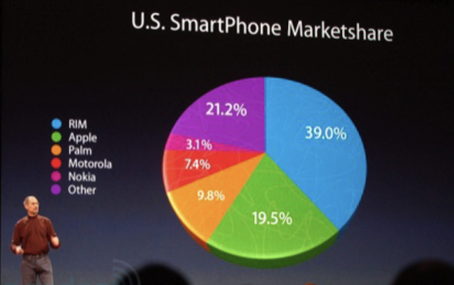
Pie chart
The following one liner from his lecture would be enough to convey the message
"Only worse thing than a piechart is two of them."
He makes a convincing case against a piechart as it is not scalable and likely to fail in conveying subtle differences in the categories.
Here is a famous example of piechart being misused.

PowerPoint
Tufte is very vocal with his thoughts about PowerPoint and believes pretty much any presentation could be done without using it.
Summary
First do no harm (to the content).
There is no such thing as information overload. There is only a lousy design.
Design cannot rescue failed content. It is a content-driven business.
There are many true statements about complex topics to fit on PowerPoint slide.
RemoveChart Junk.
Reduce recency bias.
Magic number 7 (max).
No scrollbars.
Graphics is good for data but some times words are a better choice.
No comments:
Post a Comment